


When people get into trading, a lot of them tend to look for extremely complicated indicators, thinking that they will find the “holy grail” that will do all the work for them. When you become better as a trader, you learn that there’s no such thing, and that you’re better off really mastering the basics. Here a famous Bruce Lee quote comes to mind: “I fear not the man who has practiced 10,000 kicks once, but I fear the man who has practiced one kick 10,000 times.” It’s exactly the same with trading: you don’t need to learn a hundred indicators, but you need to learn how to use just a few of them really well. In fact, if you just master the RSI (which I mentioned before), moving averages and the OBV, you’ll have all you need for the vast majority of market conditions.
On-Balance Volume (OBV) might sound like something complicated, but in fact, it’s one of the simplest indicators out there. Unlike many other indicators, it doesn’t derive its data from the price, but rather from volume, while all it takes from the price data is whether a specific candle is green or red. More specifically, the OBV simply adds up the trading volume in all previous candles on the chosen timeframe, while the volume on red candles is subtracted. So, let’s say we’re looking at the daily chart of a specific trading pair where the volume on one green day is 100, then 20 on a red day, and 150 on another green day after that. The OBV would show the values 100, 80 and 170 for these three days.
But since the OBV takes into account all of the previous trading activity, its numerical value isn’t important, rather, the crucial bit is how it changes candle to candle, and this is depicted with a simple line. Unlike the RSI, this line isn’t limited to a range from 0 to 100, and it looks a lot like a price chart if you choose the line view instead of candlesticks.
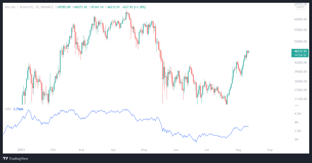
Here you can see the OBV under the chart, as it’s usually displayed
So, what does this line mean and why do I think it’s one of the best indicators out there? To see that (and I’m sure you’ll agree with me on how good of an indicator it is once you start using it), we need to cover how to trade based on the OBV. There are two main ways to use it: first, looking for divergences and, second and more interestingly, looking for breakouts and support/resistance levels.
When it comes to divergences, the OBV can be used in much the same way as the RSI: when the price forms a higher high and the OBV paints a lower high, that’s a bearish divergence. In the opposite case, with a lower low on the price and a higher low on the OBV, you have a bullish divergence. These should always be used together with other signals to confirm possible entries.
But the real interesting bit with OBV is the second method, namely breakouts and important levels. The thing is, the OBV doesn’t just look like a price line, but it can also be analyzed in the same way as a price line. That means that you can look for patterns, support/resistance levels, retests and so on. And the main reason that this can be a very good strategy is that a breakout on the OBV can happen before the breakout on the price chart. Of course, this doesn’t mean that a breakout of the price is certain (in trading, there are only probabilities), but it does mean that it’s likely to follow. The OBV breakout essentially points to a growing level of investor confidence and buy pressure, and it’s easy to see why this would lead to a breakout on the price chart as well.
Let’s take an example that happened very recently, namely with Bitcoin. If we look at the daily chart, we can see that it broke out of a Bump-and-Run Reversal (BARR) pattern on the 6th of August:
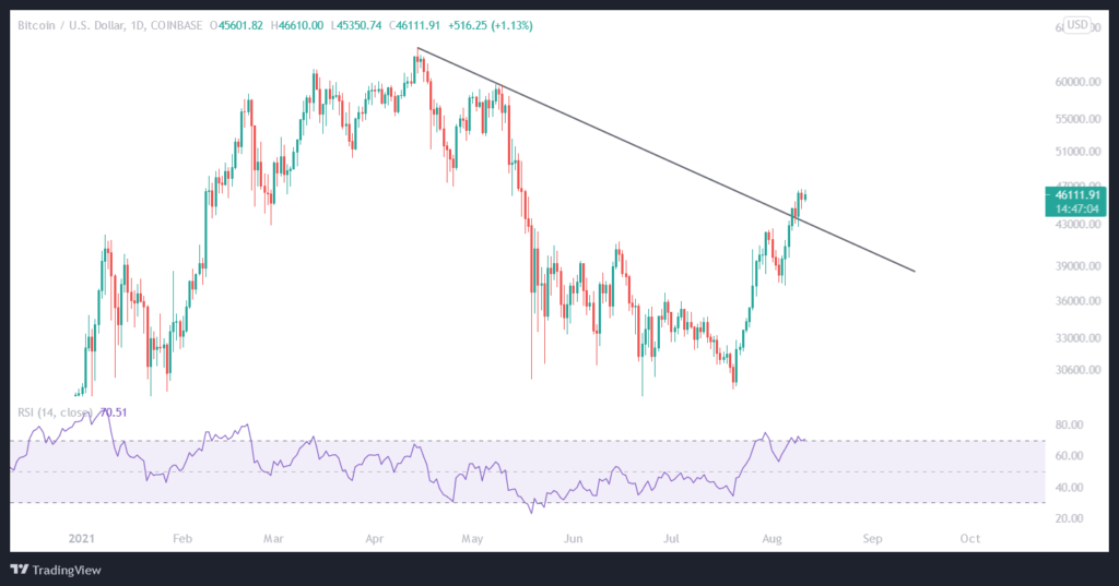
This pattern is pretty easy to see here, and it certainly looks bullish (and if you want me to cover some of these underrated patterns a bit more in another post, just let me know in the Twitter replies!). But if we look at the OBV, we can see something really interesting:
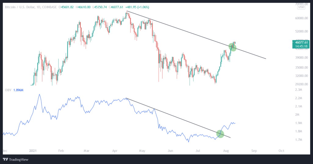
The OBV had the exact same pattern, but the breakout was confirmed on July 26th, a whole 11 days before the breakout on the price chart. Here, it’s obvious why seeing that so early can be a huge advantage. Of course, this isn’t 100% — not all OBV breakouts will carry over to the price — but it works often enough for it to be one of the most important strategies that I use personally.
It works on different time frames too, with the usual disclaimer that patterns on higher time frames tend to be more reliable. And, of course, it works for all the patterns you would use on the price chart: triangles, flags, wedges, channels etc. So, open up some charts, test this out and practice it until you’re printing more money than a central bank!


Wow! Thanks for introducing us to the world of OBV! Crypto gets interesting as we learn more of such stuffs! Keep your love coming to the bloodgang! Thank you 😊
Hi! Thanks for your nice articles!
Shouldn´t it be 230 instead of 170 on your OBV example? I thought is was a sum of everything.
ya, I think so…
Great content!
Thanks Bloodgood. This was really helpful. Thank you for sharing examples. Love your content and your teaching style.
Great context! Thank you for the insights. With sufficient amount of practice the technics will surely help to “gather the harvest”.
Big Love uncle BloodG
Muito interessante isso, para eu que estou iniciando a simplicidade vale muito.
Grato
Love these condensed lessons. Thanks very much.
Amid this sharp price movement, the chart breaks out the red line in the OBV window. So, there is another bearish signal. Along with the entire down move, starting from the very beginning of the price fall, the indicator is following the price chart, confirming the bear trend continuation.