

Any crypto trader that relies on technical analysis will look for different signs and indicators that will forecast upcoming price movements, reversals, and continuations. With their help, he can spot potential trade opportunities and hopefully create a profit. For someone that’s just starting to learn TA, understanding all these signals can quickly become extraordinarily confusing and mind-boggling as there’s an overwhelming number of indicators he can try to use, hoping they will show him the right way.
That is why today I’ll be showing you one of the simple ways you can forecast future market movements consistently. Even though it’s simple, it is quite effective, and even seasoned crypto veterans pay attention to these things. The method I’m talking about is identifying price patterns.
A price pattern is by definition a recognizable configuration of price movement of a cryptocurrency. It is identified using a series of trendlines and curves. Put simply, we’re trying to guess what the price of a cryptocurrency will do in the future based on patterns the candlesticks made in the recent past. These patterns are typically sorted into two groups: patterns that signal trend reversals and patterns that signal trend continuations. Patterns are often recognized with the help of trendlines. In a nutshell, a trendline is a straight line drawn on the price chart, connecting a series of highs or lows and it helps you spot areas of support and resistance.
The trendlines can be horizontal, pointed up or down, and can portray an uptrend or a downtrend. The trendline that connects three or more points is generally more valid than the one that is based purely on two points. We should also mention that there are a few different opinions on what points the trendlines should touch, some believing they should connect to the actual bodies of candlesticks (opens and closes), others saying they should connect to the highs and lows. I recommend you draw them connecting the actual bodies if you’re looking at the daily chart, as the opens and closes represent investors willing to hold a position overnight.
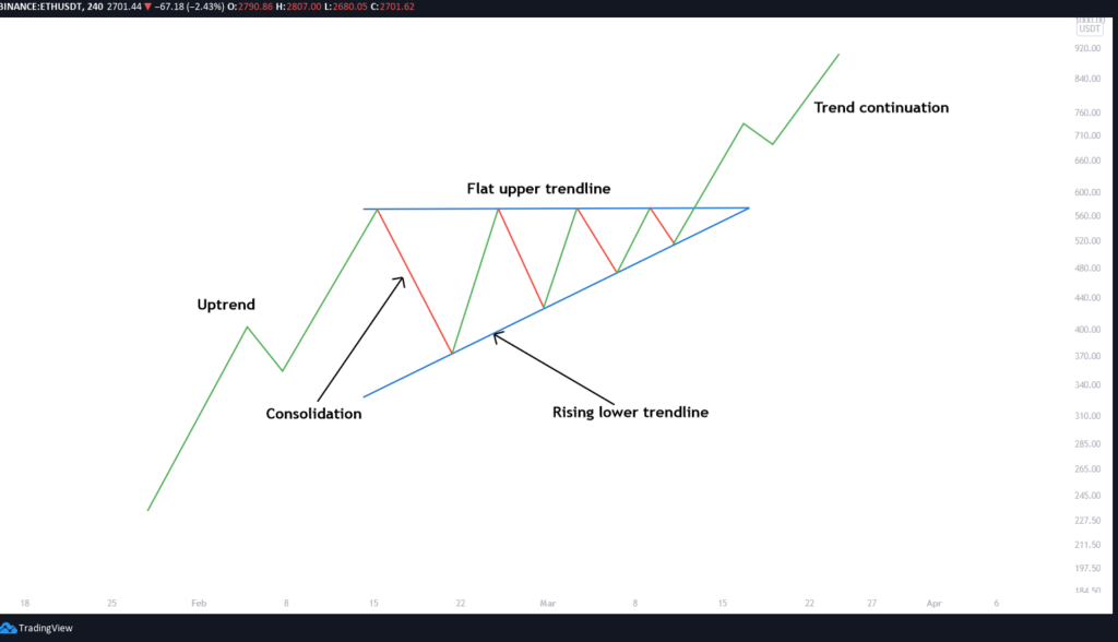
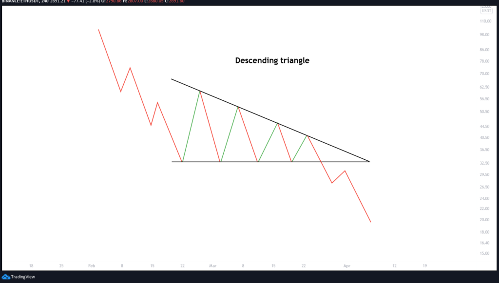
Now we can move on to the actual patterns you’re trying to spot. The first two you should remember are an ascending and a descending triangle. The ascending triangle is drawn by placing a horizontal resistance line on the resistance points together with an ascending support line, connecting gradually higher lows. Typically, it signals a bullish breakout but it’s not always the case. On the flip side, the descending triangle usually signals a bearish market downtrend, where the descending resistance line projects gradually lower highs, while the support line is horizontal. Usually, the bears win in this case, eventually breaking down through the support level.
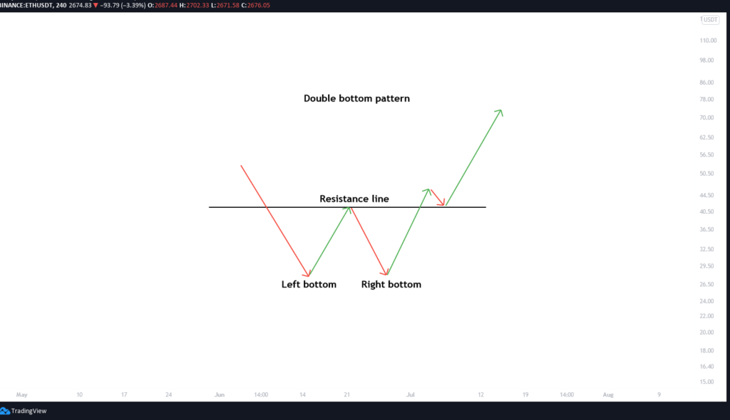
The next noteworthy chart pattern is a double bottom. It’s similar to the letter W and indicates that the bears made two unsuccessful attempts at breaking down through the support level. As a reversal chart pattern, it indicates that the price action might change course, creating an uptrend.
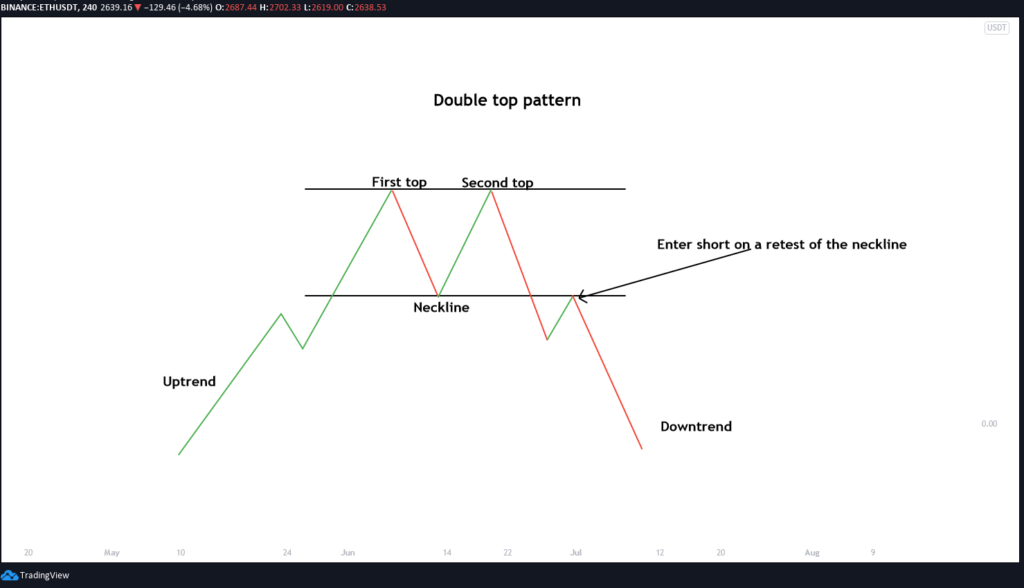
Opposite of the double bottom is the double top pattern, and as you might have guessed, it looks like the letter M and signals a downward trend reversal. Remember, you can make a profit by correctly predicting a downtrend reversal, even if the price of the token goes down. To achieve this, enter a short position when the price breaks the support trendline but make sure you also set a stop-loss a bit above the support trendline so that you’re safe in case the trend turns against you.
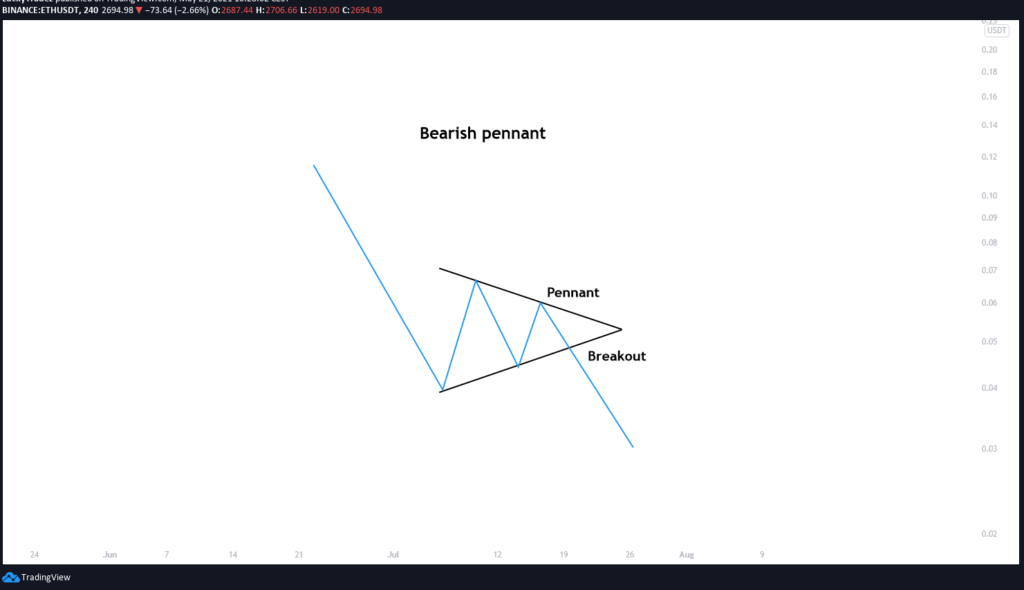
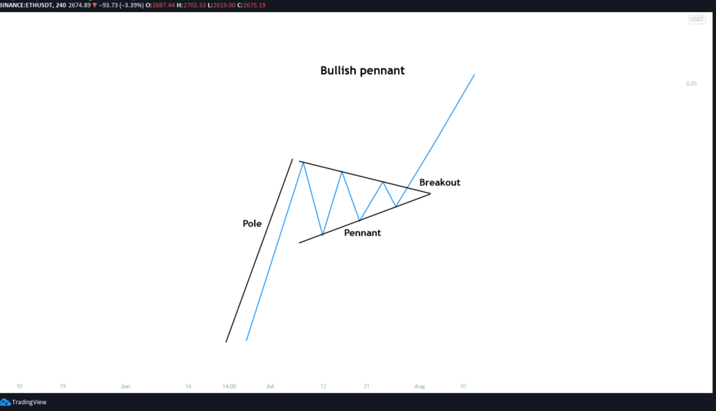
When examining the next two chart patterns, you must include the previous price trend into your analysis. The so-called pennants are trend continuation patterns. A pennant that comes after an uptrend is called a bullish pennant and it signals that the buyers are about to go buying again. After the consolidation, the trend usually continues upward. On the opposite side, if the pennant comes after a downward trend, it’s called a bearish pennant and it signals that the price will likely continue dropping after the brief consolidation.
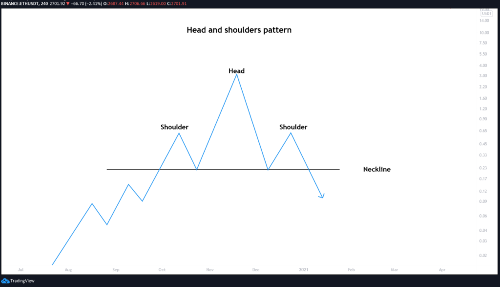
One of the most reliable trend reversal patterns is the head and shoulders pattern. It comprises of three tops where the second one is the highest and the third one is the lowest. On the bottom, the support trendline can be horizontal or can have a small slope (downward or upward). After the candlesticks reach the support line following the third peak, the price will likely drop substantially.
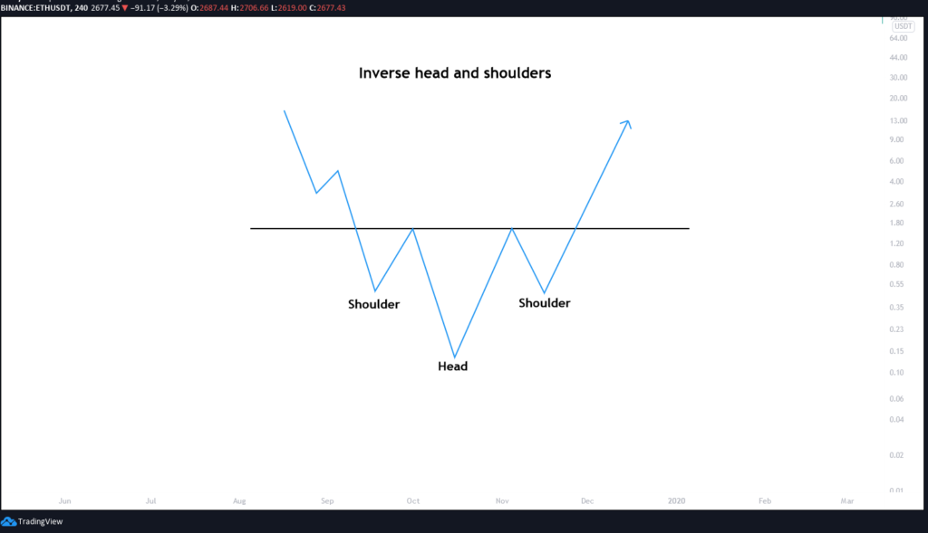
We also know of an inverse head and shoulders pattern which sort of forms three valleys where the second valley is the deepest while the first and third are higher. After the candlesticks reach the resistance neckline, the previous downward trend will likely reverse as the price will surge upward.
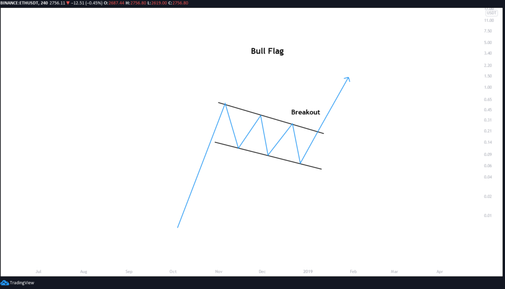
The last chart pattern I want you to be mindful of is the bullish flag. It’s called a bullish flag because its shape resembles a flag on a pole and it’s usually present in coins with strong uptrends. The flag can be drawn from candlesticks between horizontal trendlines or even between downward angled trendlines and it portrays a period of consolidation before the trend is likely to continue as the price fails to drop back down despite a sharp rise (the pole).
Understanding these basic chart patterns is one of the fundamental strategies of technical analysis and while they do bring some amount of optimism, they definitely shouldn’t be taken as signs of certain future moves. Experienced traders often combine them with other indicators and make moves based on multiple affirmative signals. There’s also a few more advanced chart patterns that I’ll cover in part two of this article. Until then, stay tuned and may the crypto gods be on your side.

Love uncle Blood, Perfetto as always 🙂
nice in thanks uncle blood