


In crypto — and in all markets — there are few websites that are as widespread as TradingView. If you know anything about TA or trading (and you definitely should if you want to put your funds into crypto), then chances are that you’ve already used TradingView, or at the very least that you’ve seen the charts posted by myself and others on Twitter.
So, to help you understand how to use TradingView and make the most of your time there, I’ve decided to prepare a guide of the most important indicators and tools that I personally use. When you open TradingView, just type in the ticker for the trading pair you want to see (for example BTC/USDT) and click “Launch chart”).
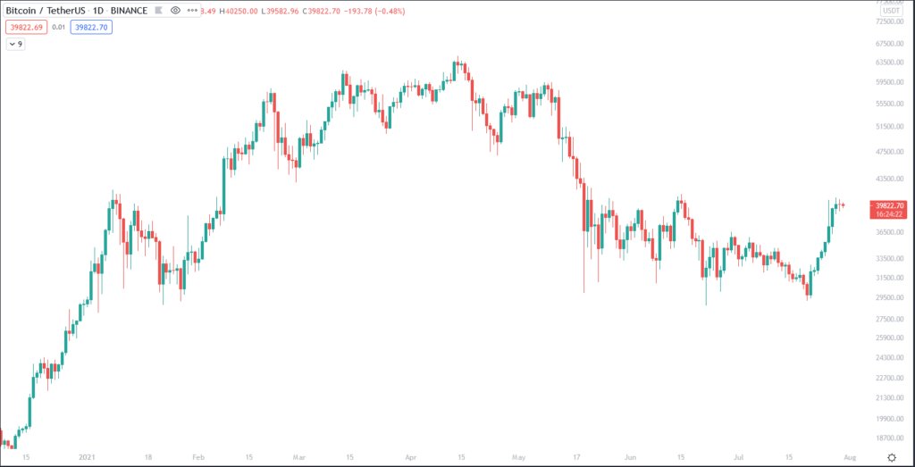
This is what the chart looks like:
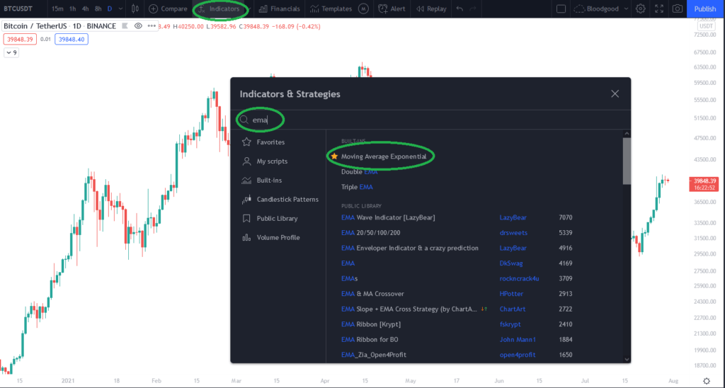
Now, I’ll first cover some of the most important indicators that I use, and then some drawing tools. Indicators can be found on the top section of the page. Just click on “Indicators,” and you’ll see a pop-up menu where you can find any indicator you want (and to learn more on how to use some of them, check out my other Medium posts).
Then, click on the indicator that you’d like to display on the chart, for example, we can go with an Exponential Moving Average (EMA):
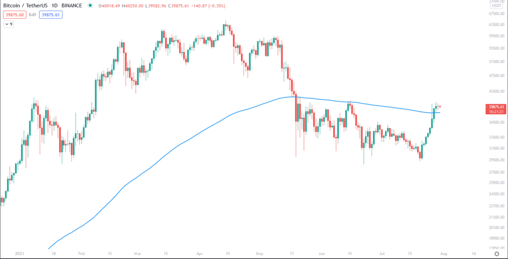
As you’ll see, an EMA line has been added to the chart. The default length is 9, so to modify it, hover over it on the top left and click the settings icon. Then, just choose the length you want, as well as the color (you can read more on different lengths in my post on MAs). When you’ve got multiple indicators on the chart, setting up the colors so that the whole chart looks good is an art on its own, and it’s one you’ll quickly learn while charting.
The same process is used for all other indicators, and some that I’d recommend you to check out (and that I always have in the Favorites section, so that they’re accessible right from the dropdown on the Indicators section) are the RSI (Relative Strength Index), OBV (On-Balance Volume), Stochastics and MACD (Moving Average Convergence Divergence).
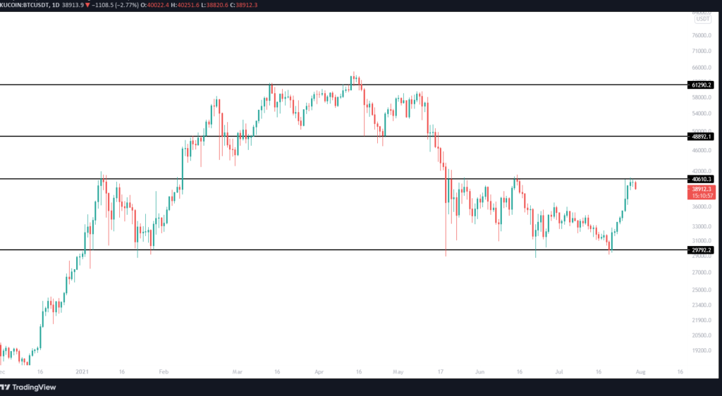
Now, we can move on to the charting tools, which are located in the sidebar on the left side of the chart. The first one to mention is the Trend line, which you can also select with Alt+T. For more on these, you can check out my post on trend lines. Another important tool are horizontal lines, which are used to map out support/resistance levels and can be added to the chart (at the level where your cursor is currently located) by pressing Alt+H. Here’s what these lines look:
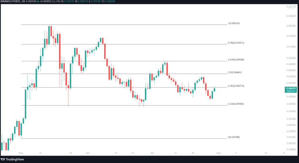
Moving on, we have the Gann and Fibonacci tools. Personally, in this group of tools, I only use the Fib Retracement, which is also the most popular and has its own shortcut (Alt+F). Select it and first click the swing high or swing low whose retracement levels you want to find, and then the most recent (opposite) high/low from which the retracement begins. There’s a lot to be said about this, and I might prepare a separate post in the future, but for now it’s enough to say that these levels are often important support/resistance levels.
Here’s what they look on the chart:
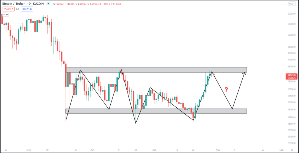
Then, you have the Geometric Shapes section, and the most important bits here are Path and Rectangle. The Path tool can be used to predict possible directions the price could take (you can also use the Brush tool for this, but only if you’ve got a steady hand, so that it won’t look like something drawn by a five year-old). The Rectangle tool is perfect for drawing zones of supply/demand, basically like support/resistance levels but extended through a price and time range.
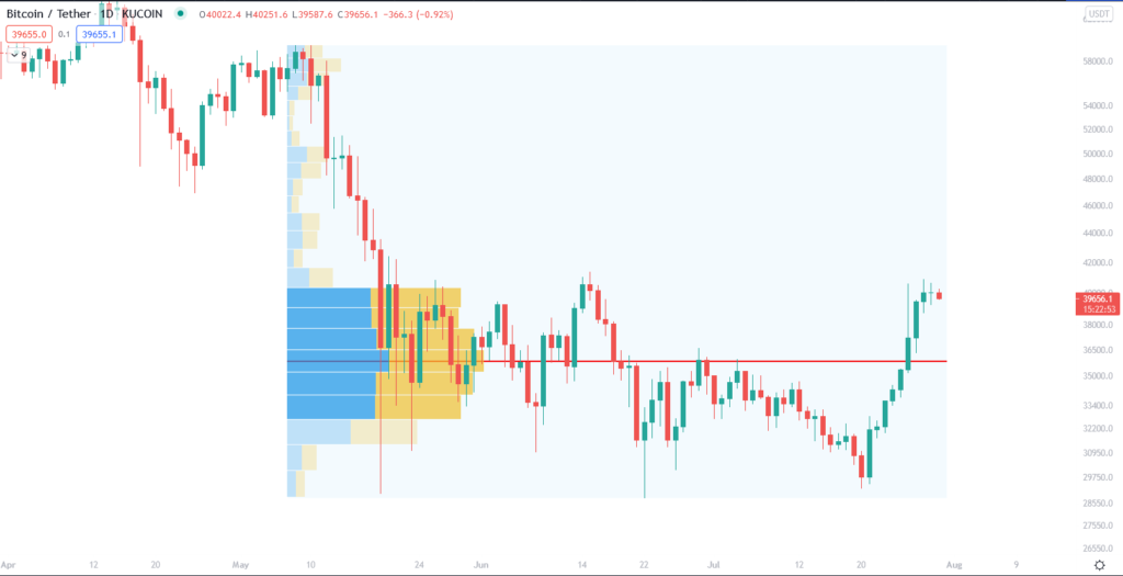
The Text section is self explanatory, and I won’t go into the Elliott wave and harmonic patterns in the Patterns section. Prediction and Measurement tools is where you’ve got your Long positions, Short positions, ranges and the Fixed Range Volume Profile. These are also self explanatory, except for the final one. The Fixed Range Volume Profile can be used to find the POC (Point of Control) for a specific period, which is the price at which most tokens have been traded and often represents an important level. What’s more, you can use it to find “volume shelves,” which are ranges that saw high volume in the selected period. I’ll get into these a bit more at some other point, but for now, here’s what it looks like:
Finally, an important tool is the Measure function. This allows you to measure the time and price difference between different points, and it can also be selected just by pressing Shift and clicking on the chart. Another important trick when using different charting tools is that you can hold Ctrl when moving the cursor around: that way, the charting tool you’re using will automatically snap to the closest candlestick level, whether it’s a wick or an open/close. This can help get everything exactly lined up with the price action, whether it’s the Fib Retracement or Trend Lines.
That’s all for now, I hope this explanation helps you start using TradingView as efficiently as possible. Of course, there’s no substitute for experience, so get to charting!


I have never seen such helping guide about crypto. It is awesome and I am learning from your web, twitter and discord. Your knowledge is worth of 21Million BTC